

Monday, February 28, 2011
Thursday, February 24, 2011
Noses

Wednesday, February 16, 2011

Thursday, February 10, 2011

Tuesday, February 8, 2011
Blood Angels Librarian
Can you tell I like Space Marines?
 I've always loved the idea of warrior mystics. Soldiers who also can cast magic (or in this case, psychic powers) are just way too cool.
Can any GW nerd tell me what power this Librarian is using? A free print to whoever gives me the right answer!

Can any GW nerd tell me what power this Librarian is using? A free print to whoever gives me the right answer!
Monday, February 7, 2011
Miss Andrea
I accompanied my nephew to his piano class yesterday and brought along my sketchbook. Here's a sketch of his teacher, Miss Andrea.


Thursday, February 3, 2011

Monday, January 31, 2011
An Experiment

What does everyone think? Honestly?? Should I try this a bit more, or just go back to my old way of rendering a lot more? Thanks!
Monday, January 24, 2011

Friday, January 21, 2011
Moonshine

Sunday, December 26, 2010
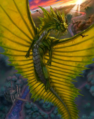
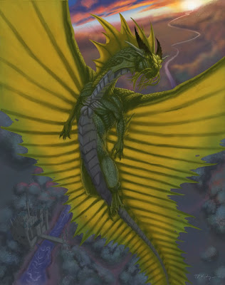
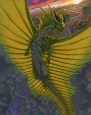
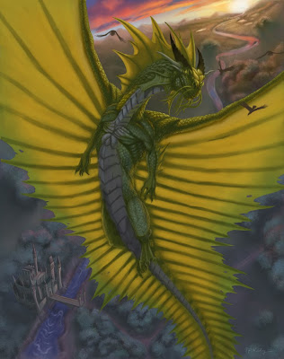
Gold Dragon
Edit 2/11/11: Worked on it some more. Thanks to Drew Baker for his excellent critique!
 Here is my latest painting, a Gold Dragon. It was done for a friend who's a big Dragonlance fan as a Christmas gift.
I thought I'd show a bit of my process, so I saved copies of the painting at various stages of completion. Here goes...
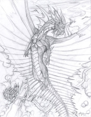
My original drawing. I try to put as much detail as possible without making the drawing overwhelming. I plan a bit of how the lighting is going to work out, but I don't overdo it. My goal is usually to have only 10-30% of the pencil drawing visible by the time the painting is done.
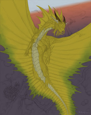
I paint entirely in Photoshop. The drawing is made into a multiply layer and reduced to about 20% opacity. I start off with a gradient for the background. I know I want to depict an early morning sunrise, during the so-called 'Golden Hour'. The dragon is chiseled out using the pen tool. I'm of two minds about the pen tool. It's really great for precision, but it can also make your painting much more artificial (ie digital) looking.
During the early part of the painting (the hardest part for me), I concentrate on light and shadow. I originally conceived the dragon as having a chrome-like neck, chest and belly, hence the pink color you see reflecting off the chest.
Obviously, I've spent a lot more time on the dragon and less on the background, but I really do make an effort to work on the entire image at once. Some people paint like this; some render entire parts of the painting to completion before moving on to the next part. Which is 'better' is anyone's guess.
I decided the chrome areas are just too distracting and will not serve to make the overall image any better and so I get rid of it. At this point, I realize I HATE the background right behind the dragon's head. I flatten those layers and apply a Gaussian blur and get ready to try again.
After a good 5 hour slog, I've brought the background to a point that I can tolerate. I notice at this point that the dragon doesn't look golden. It's more like green. Now the green in the shadow is a result of only faint blue sky acting as a fill light on gold scales, so I can't change that...
One of the best tricks I've learned is to apply a rich helping of the local color (in this case, an orange gold) to the light side, just before the terminus (start of the shadow). I also notice at this point that the focus of the image, the head is not really standing out like I should.
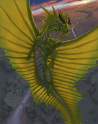
I added some shininess to the head, some cheesy God rays, and paint in the Golden Eagles (get it?). At this stage, I feel like it's pretty finished, but the contrast is lacking. I applied an adjustment layer, using Levels to bump up the contrast. Levels are really nice; I consider it a manual version of the Brightness/Contrast adjustment. It gives so much more control to the user. At this point, I consider the painting finished.
If you're reading this, I thank you for hanging with me for this long. I really hope this post helps other artists out in some way. I tried to point out my struggles, because I know we learn best from struggle, not triumph. I would never claim to have anything on Todd Lockwood or Donato Giancola, but still, I think this adventure was worth sharing. Let me know what you think.
Well, Merry Christmas everyone. May you have a blessed New Year, filled with new struggles, growth and triumphs.


I thought I'd show a bit of my process, so I saved copies of the painting at various stages of completion. Here goes...

My original drawing. I try to put as much detail as possible without making the drawing overwhelming. I plan a bit of how the lighting is going to work out, but I don't overdo it. My goal is usually to have only 10-30% of the pencil drawing visible by the time the painting is done.

I paint entirely in Photoshop. The drawing is made into a multiply layer and reduced to about 20% opacity. I start off with a gradient for the background. I know I want to depict an early morning sunrise, during the so-called 'Golden Hour'. The dragon is chiseled out using the pen tool. I'm of two minds about the pen tool. It's really great for precision, but it can also make your painting much more artificial (ie digital) looking.

During the early part of the painting (the hardest part for me), I concentrate on light and shadow. I originally conceived the dragon as having a chrome-like neck, chest and belly, hence the pink color you see reflecting off the chest.
Obviously, I've spent a lot more time on the dragon and less on the background, but I really do make an effort to work on the entire image at once. Some people paint like this; some render entire parts of the painting to completion before moving on to the next part. Which is 'better' is anyone's guess.

I decided the chrome areas are just too distracting and will not serve to make the overall image any better and so I get rid of it. At this point, I realize I HATE the background right behind the dragon's head. I flatten those layers and apply a Gaussian blur and get ready to try again.

After a good 5 hour slog, I've brought the background to a point that I can tolerate. I notice at this point that the dragon doesn't look golden. It's more like green. Now the green in the shadow is a result of only faint blue sky acting as a fill light on gold scales, so I can't change that...

One of the best tricks I've learned is to apply a rich helping of the local color (in this case, an orange gold) to the light side, just before the terminus (start of the shadow). I also notice at this point that the focus of the image, the head is not really standing out like I should.
I added some shininess to the head, some cheesy God rays, and paint in the Golden Eagles (get it?). At this stage, I feel like it's pretty finished, but the contrast is lacking. I applied an adjustment layer, using Levels to bump up the contrast. Levels are really nice; I consider it a manual version of the Brightness/Contrast adjustment. It gives so much more control to the user. At this point, I consider the painting finished.
If you're reading this, I thank you for hanging with me for this long. I really hope this post helps other artists out in some way. I tried to point out my struggles, because I know we learn best from struggle, not triumph. I would never claim to have anything on Todd Lockwood or Donato Giancola, but still, I think this adventure was worth sharing. Let me know what you think.
Well, Merry Christmas everyone. May you have a blessed New Year, filled with new struggles, growth and triumphs.
Tuesday, December 14, 2010
Sam Nielson's Advanced Lighting
Sorry I've been slow to update. My class with Sam Nielson is about to come to a close, so I will be posting a bit more regularly very soon. In the meantime, here's one of my assignments, painting hair. The original monster design is Sam's. The rendering was left to us. The feathers in the mouth were my idea. :-)

If you're really serious about getting better and learning everything you didn't learn in art school, but should've, I'd highly recommend this class. Just realize it's a humbling experience, but one that will leave you all the greater of an artist for it.

If you're really serious about getting better and learning everything you didn't learn in art school, but should've, I'd highly recommend this class. Just realize it's a humbling experience, but one that will leave you all the greater of an artist for it.
Tuesday, November 23, 2010
When Pigs Fly....

An artistic take on the famous adynaton, 'when pigs fly'. Thanks for the idea, Christina. I don't think this was quite what you had in mind though.....
In other news, I was lucky enough to discover Claire Wendling. If you want an artist who can draw, and I mean REALLY draw, she's someone you should look up. Stuart Ng offers a nice selection of her books. Check it out!
Edit: Added another, cuter flying pig. It's airborne porcine madness!

Monday, November 22, 2010
New Dragon Line Art

A new piece I'm working on. It's going to be a gift, so I'm pulling out all the stops. Wish me luck! Thanks!
Monday, November 15, 2010
Sketches....
Hi...uuhhh...remember me? Sorry about the monthlong delay on updates. In my defense, I'm taking an online class right now with Schoolism taught by the incomparable (and tough grader...) Sam Nielsen. It's an amazing class, but it takes up almost all my time. Here are some sketches I've been able to sneak in....


Don't mind the elephant that's bleeding through on the left side....


Friday, October 15, 2010

Thursday, October 14, 2010
Panda Birthday
A birthday card I did for a friend. I hope this image explains, loud and clear, why I DON'T do cute and cartoony!

Happy Birthday Jocelyn!

Happy Birthday Jocelyn!
Friday, October 8, 2010
IF: Beneath

'Food that brings its own toothpick!'
My entry for Illustration Friday. It's not quite a finished as I'd like, but deadlines are deadlines. Check back in a few days, I will have a finished version. Thanks!
Monday, October 4, 2010
Daemons and Dragons
Here's a new painting of U'zhul the Skulltaker, from Games Workshop. I'm not too crazy with how GW depicted him, so I've made a few changes. His Cloak of Skulls is now a cape of chains-because nothing says bad ass as having tons of chains hanging from your back. I do really like his story however. Villains are so much fun and this evil, arrogant but honorable trophy hunter was a compelling creature. The painting itself was partly inspired by the movie poster for The Shawshank Redemption.

And yes, I know it's 'demon', but seeing how this is a British IP, I figured I should defer to their spelling of 'daemon'.
And here's a revisit of the Forest Dragon painting I did a while back.

Thanks to TL for the critique. I'm very grateful that you shared your time and knowledge with me.

And yes, I know it's 'demon', but seeing how this is a British IP, I figured I should defer to their spelling of 'daemon'.
And here's a revisit of the Forest Dragon painting I did a while back.

Thanks to TL for the critique. I'm very grateful that you shared your time and knowledge with me.
Friday, October 1, 2010
Night Dragon

A painting I did for the Sketchaholic interview for my friend, who I've never met, Master Concept Artist and All Around Nice Guy, Charles Santoso. Check out his work. Congrats Charles!
Subscribe to:
Comments (Atom)