Thursday, June 16, 2011

Phillustration Show 2011

Just a quick post today. I was pleasantly surprised to learn that three of my pieces have been accepted to the Phillustration 2011 show, in Philadelphia, PA which will take place on June 26th. These are the accepted entries. They will all be up for sale at the show. Thanks to the Philadelphia Sketch Club, to Christina Hess, from whom I found out about the show, and to David Palumbo, the juror for the show.


Thursday, June 2, 2011

IF: Asleep

For Illustration Friday.
Painting will come soon. I usually don't render in pencil anymore because I do so much digitally now. I figured this is a good excuse to just work with pencil and value again. Hope you like it!

Wednesday, June 1, 2011

Spiderwoman

For the Alphabeastiary. This creature is called the Jorōgumo, or 'whore spider'.
This was a bit of a struggle for me. Here are some thumbs and whatnots I did trying to figure this one out.

Wednesday, May 25, 2011

Stegosaurus

I just felt like drawing a dinosaur today. Figured I try the speedpainting and 'experimenting with brushes' thing with it.

Sunday, May 15, 2011

Eowyn and the Nazgul

Sorry it's been a while! I've been slaving away at the latest ArtOrder challenge. It's been a while since I did ArtOrder, so I wanted to make sure this one was good. And what an awesome challenge! Depict the battle between Eowyn and the Witch King from the Return of the King.
Naturally, I gravitated towards giving the Fell Beast a lot of attention!
Here are some of the progress sketches. Note how eager I was towards making the Fell Beast HUGE before the good folks at Muddy Colors reined me back in.

Tuesday, April 19, 2011

Drawathon

I hit the Pratt Drawathon last Friday night and broke out my pastels for the first time in 4-5 years. Here's the only two I liked...

Monday, February 28, 2011

Pipsqueak

Meet my new best friend!
This is a painting done for the Alphabeastiary. Hope you like it!

Thursday, February 24, 2011

Noses

I needed some practice with noses, so a while back, I kept a large piece of paper at the side of my desk at work. Sometimes during lunch or lulls in work, I drew a few from photographs. Here's the result. I hope to make this into a habit.

Wednesday, February 16, 2011

Tuesday, February 8, 2011

Blood Angels Librarian

Can you tell I like Space Marines?
I've always loved the idea of warrior mystics. Soldiers who also can cast magic (or in this case, psychic powers) are just way too cool.

Can any GW nerd tell me what power this Librarian is using? A free print to whoever gives me the right answer!

Monday, February 7, 2011

Miss Andrea

I accompanied my nephew to his piano class yesterday and brought along my sketchbook. Here's a sketch of his teacher, Miss Andrea.

Thursday, February 3, 2011

Crimson Fists

Another Warhammer 40k sketch. Today, it's the implacable Crimson Fists.

Monday, January 31, 2011

An Experiment

Well, I painted the Raptors. This all really spontaneous, actually. The drawing was just a doodle in the sketchbook, but I figured, well, I got this far, let's paint it. I decided I wanted to have a sketchier look to the piece. I've always loved artwork where you can see the process. I don't like work that's over rendered. For this piece, I thought I'd try to have more of my sketch showing through.

What does everyone think? Honestly?? Should I try this a bit more, or just go back to my old way of rendering a lot more? Thanks!

Monday, January 24, 2011

Chaos Raptors

A doodle of Warhammer 40000 Raptors. I should do this more often. It's fun!

Friday, January 21, 2011

Moonshine

If the delicate, beautifully rendered drawings of Reubens are a Merlot, and strong, bold lines of Cornwell are a Guinness, this drawing must be moonshine. Or industrial alcohol. Or some sick mixture of both. With dead hornets floating around.

Sunday, December 26, 2010

Gold Dragon

Edit 2/11/11: Worked on it some more. Thanks to Drew Baker for his excellent critique!
Here is my latest painting, a Gold Dragon. It was done for a friend who's a big Dragonlance fan as a Christmas gift.
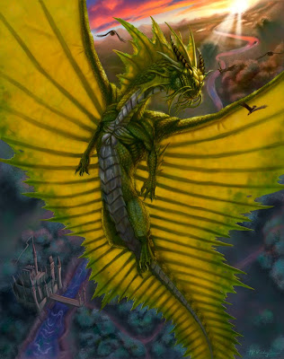


I thought I'd show a bit of my process, so I saved copies of the painting at various stages of completion. Here goes...
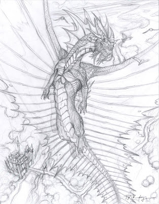

My original drawing. I try to put as much detail as possible without making the drawing overwhelming. I plan a bit of how the lighting is going to work out, but I don't overdo it. My goal is usually to have only 10-30% of the pencil drawing visible by the time the painting is done.
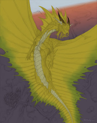

I paint entirely in Photoshop. The drawing is made into a multiply layer and reduced to about 20% opacity. I start off with a gradient for the background. I know I want to depict an early morning sunrise, during the so-called 'Golden Hour'. The dragon is chiseled out using the pen tool. I'm of two minds about the pen tool. It's really great for precision, but it can also make your painting much more artificial (ie digital) looking.
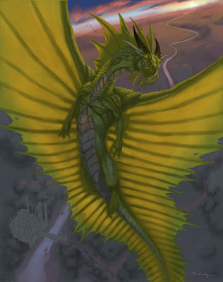

During the early part of the painting (the hardest part for me), I concentrate on light and shadow. I originally conceived the dragon as having a chrome-like neck, chest and belly, hence the pink color you see reflecting off the chest.
Obviously, I've spent a lot more time on the dragon and less on the background, but I really do make an effort to work on the entire image at once. Some people paint like this; some render entire parts of the painting to completion before moving on to the next part. Which is 'better' is anyone's guess.
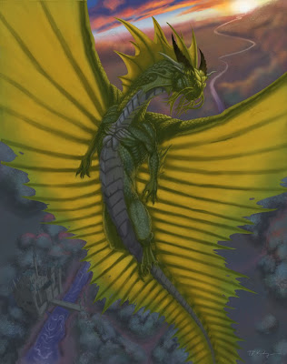

I decided the chrome areas are just too distracting and will not serve to make the overall image any better and so I get rid of it. At this point, I realize I HATE the background right behind the dragon's head. I flatten those layers and apply a Gaussian blur and get ready to try again.
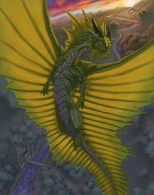

After a good 5 hour slog, I've brought the background to a point that I can tolerate. I notice at this point that the dragon doesn't look golden. It's more like green. Now the green in the shadow is a result of only faint blue sky acting as a fill light on gold scales, so I can't change that...
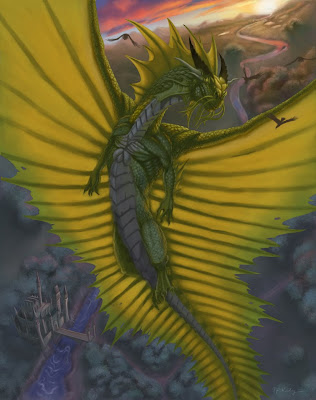

One of the best tricks I've learned is to apply a rich helping of the local color (in this case, an orange gold) to the light side, just before the terminus (start of the shadow). I also notice at this point that the focus of the image, the head is not really standing out like I should.


I added some shininess to the head, some cheesy God rays, and paint in the Golden Eagles (get it?). At this stage, I feel like it's pretty finished, but the contrast is lacking. I applied an adjustment layer, using Levels to bump up the contrast. Levels are really nice; I consider it a manual version of the Brightness/Contrast adjustment. It gives so much more control to the user. At this point, I consider the painting finished.

If you're reading this, I thank you for hanging with me for this long. I really hope this post helps other artists out in some way. I tried to point out my struggles, because I know we learn best from struggle, not triumph. I would never claim to have anything on Todd Lockwood or Donato Giancola, but still, I think this adventure was worth sharing. Let me know what you think.

Well, Merry Christmas everyone. May you have a blessed New Year, filled with new struggles, growth and triumphs.

Tuesday, December 14, 2010

Sam Nielson's Advanced Lighting

Sorry I've been slow to update. My class with Sam Nielson is about to come to a close, so I will be posting a bit more regularly very soon. In the meantime, here's one of my assignments, painting hair. The original monster design is Sam's. The rendering was left to us. The feathers in the mouth were my idea. :-)

If you're really serious about getting better and learning everything you didn't learn in art school, but should've, I'd highly recommend this class. Just realize it's a humbling experience, but one that will leave you all the greater of an artist for it.
Related Posts Plugin for WordPress, Blogger...