Here is my latest painting, a Gold Dragon. It was done for a friend who's a big Dragonlance fan as a Christmas gift.
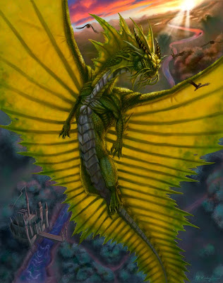
I thought I'd show a bit of my process, so I saved copies of the painting at various stages of completion. Here goes...
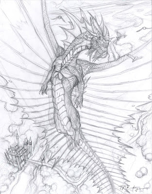
My original drawing. I try to put as much detail as possible without making the drawing overwhelming. I plan a bit of how the lighting is going to work out, but I don't overdo it. My goal is usually to have only 10-30% of the pencil drawing visible by the time the painting is done.
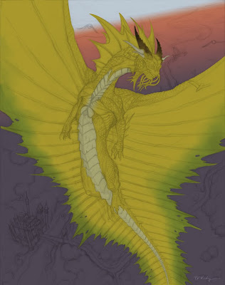
I paint entirely in Photoshop. The drawing is made into a multiply layer and reduced to about 20% opacity. I start off with a gradient for the background. I know I want to depict an early morning sunrise, during the so-called 'Golden Hour'. The dragon is chiseled out using the pen tool. I'm of two minds about the pen tool. It's really great for precision, but it can also make your painting much more artificial (ie digital) looking.
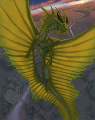
During the early part of the painting (the hardest part for me), I concentrate on light and shadow. I originally conceived the dragon as having a chrome-like neck, chest and belly, hence the pink color you see reflecting off the chest.
Obviously, I've spent a lot more time on the dragon and less on the background, but I really do make an effort to work on the entire image at once. Some people paint like this; some render entire parts of the painting to completion before moving on to the next part. Which is 'better' is anyone's guess.
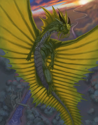
I decided the chrome areas are just too distracting and will not serve to make the overall image any better and so I get rid of it. At this point, I realize I HATE the background right behind the dragon's head. I flatten those layers and apply a Gaussian blur and get ready to try again.
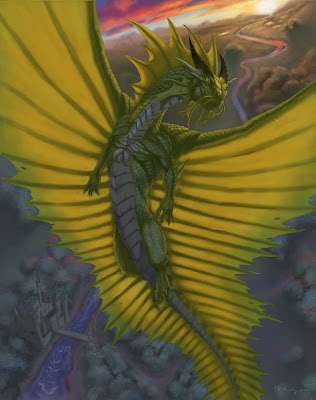
After a good 5 hour slog, I've brought the background to a point that I can tolerate. I notice at this point that the dragon doesn't look golden. It's more like green. Now the green in the shadow is a result of only faint blue sky acting as a fill light on gold scales, so I can't change that...
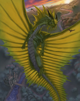
One of the best tricks I've learned is to apply a rich helping of the local color (in this case, an orange gold) to the light side, just before the terminus (start of the shadow). I also notice at this point that the focus of the image, the head is not really standing out like I should.

I added some shininess to the head, some cheesy God rays, and paint in the Golden Eagles (get it?). At this stage, I feel like it's pretty finished, but the contrast is lacking. I applied an adjustment layer, using Levels to bump up the contrast. Levels are really nice; I consider it a manual version of the Brightness/Contrast adjustment. It gives so much more control to the user. At this point, I consider the painting finished.
If you're reading this, I thank you for hanging with me for this long. I really hope this post helps other artists out in some way. I tried to point out my struggles, because I know we learn best from struggle, not triumph. I would never claim to have anything on Todd Lockwood or Donato Giancola, but still, I think this adventure was worth sharing. Let me know what you think.
Well, Merry Christmas everyone. May you have a blessed New Year, filled with new struggles, growth and triumphs.


